
Home
Chicago Love
Overview
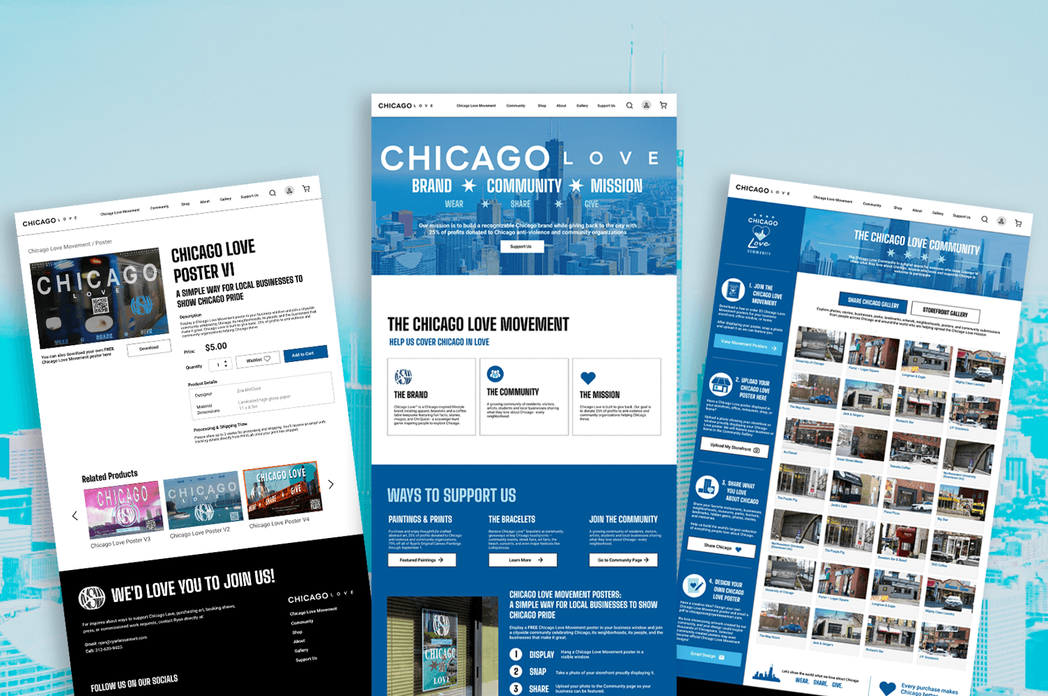
Chicago Love™ is a Chicago-inspired lifestyle brand and non-profit creating apparel, bracelets, and a coffee-table keepsake featuring fun facts, stories, images, and Chi-Quest, a scavenger-hunt game inspiring people to explore Chicago. Their website struggled with navigation, messaging, branding, and overall structure. I came in as Assistant Managing Director of Web Design to rebuild it from the ground up and bring credibility, modernization, and professionalism to the movement's home.
Context
Web Design, Web Development, Brand Design
Role(s)
Assistant Managing Director of Web Design. I managed a team of 4 in website design and development, established the company design system and brand guidelines, and organized pitch decks and site plugins.
Skills
Tools

Project Breakdown
Problem
Chicago Love’s website didn’t reflect the credibility or energy of the movement. Poor navigation, inconsistent branding, and missing pages made it hard for visitors to understand the brand or take action.
After auditing the site and talking with the team, these were the core issues holding the brand back:
No Brand Consistency or Design System
The site looked unprofessional and inconsistent across pages, which undermined trust in a brand built around community and giving back.
Missing Critical Pages and Functionality
There was no community page, no e-commerce flow, and no forum. Key touchpoints for driving donations and engagement were completely absent.
Weak Navigation and No Footer
The navigation was cluttered and confusing and there was no footer, leaving visitors without clear paths to learn more, shop, or support the cause.
Solution
I redesigned the site with a clear design system and brand guidelines, created the Chicago Love Movement page and Community page from scratch, built out e-commerce and community forum functionality including a review and moderation system, overhauled the navigation to be more concise and organized, and built a footer that didn’t exist before. Lighthouse audits were used throughout to track improvements in SEO, mobile UX, and page load performance.
A Fusion Site: Abstract Art Meets Community Movement
Chicago Love's site originally started to support the artist Ryan Lessam and build a gallery and sales platform to sell his abstract art. Today, the site is evolving to incorporate the Chicago Love initiative through housing a lifestyle brand storefront, a non-profit mission hub, and a community forum. These are four completely different user intents all landing on the same domain.
The challenge was designing a landing page that could speak to all of those visitors without watering down any of them. Someone coming to buy a Chicago Love hoodie and someone coming to browse original abstract art prints are in totally different headspaces, but both should feel like they landed in the right place.
Multiple Entry Points
I designed the landing page with clear visual wayfinding. Distinct sections with direct paths to the art gallery, the shop, and the mission page let visitors figure out where they're going within a few seconds of landing.
Abstract Art as the Visual Anchor
Ryan Lessam's abstract art is showcased large and bold as the visual centerpiece of the site. Rather than feeling like a separate thing tacked on, the art sets the tone for the brand's creative identity.
Keeping Commerce Connected to the Cause
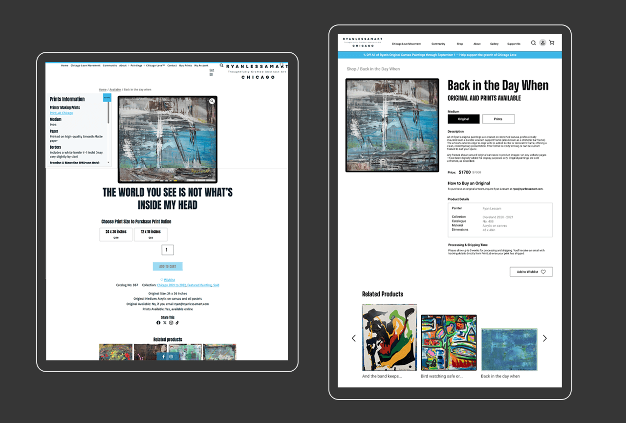
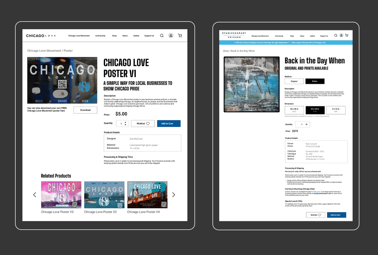
On a site that sells art and apparel alongside a community mission, it's easy for the commercial side to start feeling disconnected from the cause. I made sure the impact of purchasing was always close to the product, so buying something always felt like part of supporting Chicago.
One Design System Across Everything
Shared typography, color, and spacing made everything feel like it came from the same place even as the content shifted from editorial art to forum posts to product listings.
Home / Landing Page
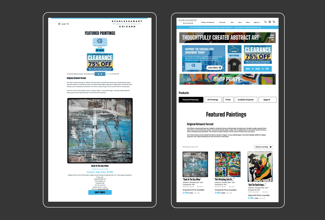
(Left) Old Landing Page, (Right) New Landing Page
Chicago Love Movement Page
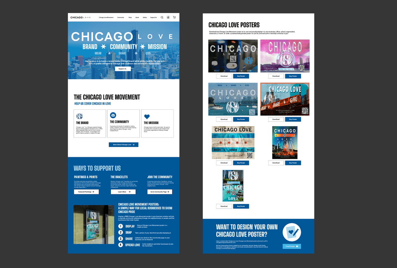
This page didn't exist before I built it. The whole point was to give the brand's mission its own home so visitors could actually understand why Chicago Love exists and how to get involved. Without it the non-profit side of the brand was basically invisible.
Community Page and Forum
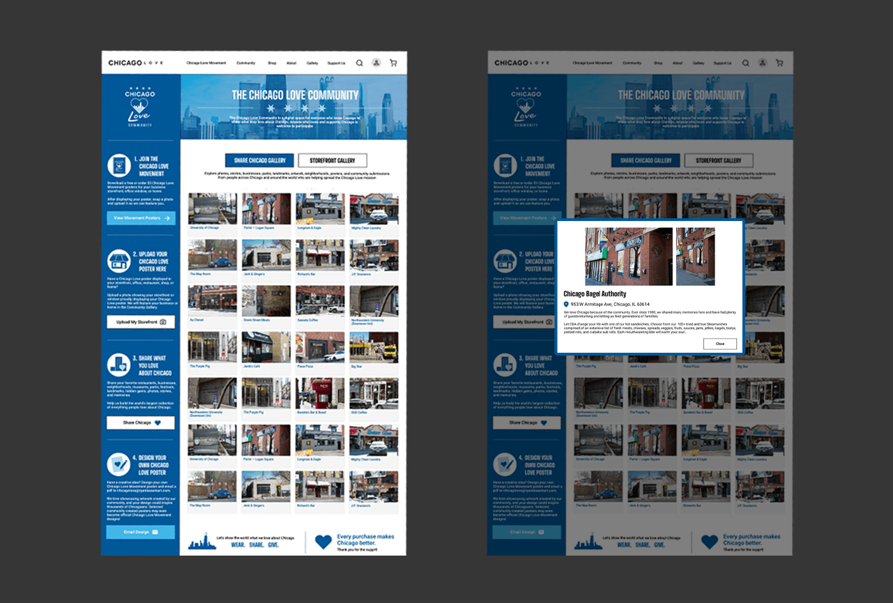
Another page I built from scratch. A brand centered on Chicago community should have an actual place for that community online. I designed the forum UI and also built a review and moderation system so the small team could keep the space managed without a lot of overhead.
Product and E-Commerce Pages
Figma File and Design System
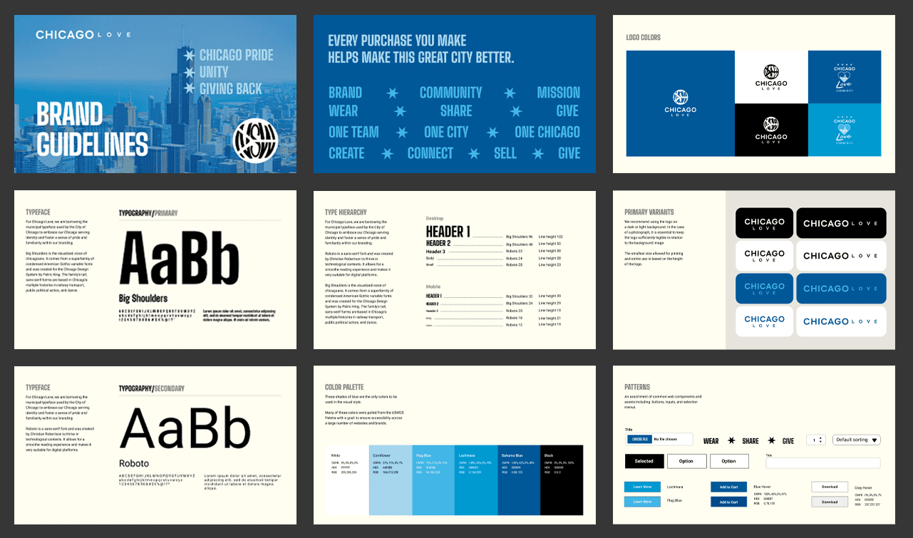
One of the first things I tackled was setting up and organizing the Figma file so the team could actually use it. The previous state of design assets was scattered so I rebuilt the file structure from scratch to make it clean, collaborative, and easy to hand off.
File Structure and Pages
I organized the Figma file into clearly labeled pages for each section of the site, a dedicated cover page, a style guide page, and a components page. This made it easy for anyone on the team to jump in and find what they needed without digging around.
Mobile and Desktop Designs
Every page was designed in both mobile and desktop breakpoints so developers had clear references for responsive behavior. Frames were clearly labeled and laid out side by side so the differences were easy to see at a glance.
Component Library
I built out a component library with reusable buttons, cards, nav elements, form fields, and section layouts. Components were set up with variants so the team could swap states without rebuilding anything and everything stayed consistent across pages.
Typography and Color
I set up a formal type scale and color palette as Figma styles so they applied consistently across the whole file. Anyone adding a new section was automatically working within the brand system without having to think about it.
Designing for a Non-Profit
Designing for a non-profit is a different mindset than designing for a typical commercial product. The audience is wider and includes donors, volunteers, community members, and customers all at once.
Trust Has to Come First
People give money and their attention to organizations they trust. Every design choice from typography to imagery to copy had to communicate legitimacy. The old site was accidentally undermining this and the team didn't realize it. A more professional presentation directly increases the chance someone donates or makes a purchase.
Keep the Mission Visible
The 25% donation pledge is Chicago Love's biggest differentiator and the reason someone might choose to buy from them over any other apparel brand. It needed to be front and center, not buried somewhere. I made sure it showed up in the hero, on product pages, and throughout the movement page so visitors couldn't miss it.
Accessibility and Reach
Community organizations serve a really wide range of people across ages and devices. Lighthouse audits caught things like contrast issues, missing alt text, and tap targets that were too small on mobile. Fixing those isn't just good practice, it's how you make sure the community can actually access what you built.
Build for a Small Team
Non-profit web teams are small and the systems you build have to be maintainable without a dedicated developer around. The design library, plugin organization, and moderation tooling all had to be simple enough that the team could keep things running and add new pages without needing a lot of hand-holding.
Bounce Rate Impact
Reducing bounce rate by 30% means more people stayed long enough to read about the mission, explore the community, or complete a purchase. For a non-profit where every visitor is a potential donor or advocate, that's a real difference.
Go back to the top